Question 4 Response Prezi
Sunday, April 5, 2020
Saturday, April 4, 2020
Thursday, April 2, 2020
Designing of Final Double Page Spread 2
#9. I added the second section of the feature story into the second column. I also resized the text appropriately to take up space and flow with the image above.
#10. I added a pull quote on the main image of the subject. Using the duplication toll and proper re-positioning, I created the illusion of a shadow on the text. The pull quote is also in a different font from the title, body, and sub-heading.
#11. I noticed the redundancy of putting "Nasir Coffee" in the sub-heading of the picture as the feature story is already titled this. I replaced the name with the mention of his accolade.
#12. I added a second pull quote, using the same techniques detailed in Step 10.
#13. I finalized and re-positioned both pull quotes.
#14. I edited the layout of the "NASIR COFFEE" title on the right half of the spread. I centered the text boxes, as it looks more natural than the layout I initially used.
#15. I changed the background color to a navy blue, to make the title more eye catching. The contrast between red and white on a darkish blue seemed more attractive than plain black on white. The main body text was changed to gray.
#16. The Finalized Double Page Spread
Wednesday, April 1, 2020
Designing of Final Double-Page Spread
Over the next two entries, I will have detailed the step-by-step process on how I designed and arrived at my final cover page for my sports magazine, The Locker Room:
#1. Using the service Canva, I selected a template that resembled a double page spread to start the design process.
#2. I cropped the template to appropriate size and removed the default designs that came with it to have a blank slate.
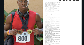
#3. I add the photo of my subject to the double page spread.
#4. I increase the size of the photo and crop it to fit on the left half of the double page spread.
#5. I add the title "NASIR COFFEE" on the right half of the double page spread. I used a 56-point font, as this will be the largest text on the DPS.
#6. I added the first section of the feature story, since it will be in a two-column format.
#7. I added the second image of my subject to the double page spread.
#8. I resized the image, placed it at the beginning of the second column, and added a sub-heading to it.. I've also resized the first column of the feature story to leave less blank space.
Subscribe to:
Comments (Atom)
Response to Compulsory Question 4
Question 4 Response Prezi
-
Cover Page Contents Page Double Page Spread Double Page Spread (LEFT) Double Page Spread (RIGHT)
-
Over the next two entries, I will have detailed the step-by-step process on how I designed and arrived at my final cover page for my sports ...


