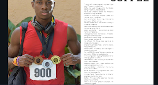
#1. Using the service Canva, I selected a template that resembled a double page spread to start the design process.
#2. I cropped the template to appropriate size and removed the default designs that came with it to have a blank slate.
#3. I add the photo of my subject to the double page spread.
#4. I increase the size of the photo and crop it to fit on the left half of the double page spread.
#5. I add the title "NASIR COFFEE" on the right half of the double page spread. I used a 56-point font, as this will be the largest text on the DPS.
#6. I added the first section of the feature story, since it will be in a two-column format.
#7. I added the second image of my subject to the double page spread.
#8. I resized the image, placed it at the beginning of the second column, and added a sub-heading to it.. I've also resized the first column of the feature story to leave less blank space.


No comments:
Post a Comment