Thursday, October 31, 2019
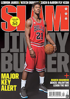
Single-Athlete Cover Ideas
Following the results of my magazine survey, I will be creating a cover with only ONE athlete. This will place an emphasis on only one player as opposed to a “dynamic duo”, rivalry, or a team-oriented issue. The following covers of different athletes are what I will be using to build my own cover. I may combine different elements from these covers for my own.
In these examples, the athletes are by themselves in a mostly plain background. The color scheme of the specific magazines are built around the athletes' uniform, something I may need to do for my magazine. I prefer these types of covers as distractions are limited in the background of the cover image. Having only one athlete will mean that the double page spread will be focused on them, while still allowing flexibility with the design of the contents page.
Saturday, October 26, 2019
Market Research Analysis
This post will serve as my personal analysis of the results of my magazine survey:
- Not many people who participated have read a sports magazine.
- Those who have see player updates as the most important facet of the magazine.
- Respondents feel that “The Locker Room” would be the best title for my magazine.
- Most people want to see interviews of a player (or players) within the magazine.
- The cover should have ONE athlete, maybe to reduce the distractions on the cover and establish who the content inside the magazine will be about.
- The overall color scheme should be red and black. This will be important to the presentation of the cover model, as well as the contents inside the magazine.
These responses will be considered important points during the development and creation of this magazine.
Friday, October 25, 2019
Market Research Results
Question 1: Have you ever read a sports-themed magazine?
Question 3: Which magazine title grabs your attention BEST?
Question 4: Which of the following components most interests you in a sports magazine?
Question 5: What do you expect to see on the cover of this magazine?
Question 7: What color scheme should this magazine have?
Question 6 (free response): What do you expect to see in a sports-themed magazine?
- Most responses focused on the same idea: Photos of the athletes involved in the specific issue of the magazine. Other responses concerned athletes' achievements and coverage of sporting events
Thursday, October 24, 2019
Market Research Questions
In order to gain a better understanding of who I am making this magazine for, I will be conducting a survey for my classmates to participate in. The questions are all related to sports magazines, such as:
The responses will help me create a better magazine that will be attractive to the intended target audience. It will also help me hone in on a specific idea for the magazine, such as the color scheme and the title.
- Have you ever read a sports magazine?
- Which component of a sports magazine most interests you?
- What color-scheme should the magazine have?
- What do you expect to see on the cover of the magazine?
- Which title best grabs your attention?
Saturday, October 19, 2019
Sports Magazine Inspiration
After roughly a month of research, I have decided to create a magazine with a sports theme. This magazine genre is popular as they allow readers to keep track of their favorite players and teams. Below, I have attached magazine covers portraying different sports. I will create my magazine cover based on one of these images, as they are crucial to conveying a message to the reader. For instance, a golf magazine may have an entirely different presentation than a basketball magazine.
 |
| Baseball (Baseball Digest) |
 |
| Golf (Golf Magazine Australia) |
 |
| Basketball (Sports Illustrated NBA Issue) |
 |
| Tennis (TENNIS Magazine) |
 |
| Soccer (World Soccer) |
Thursday, October 17, 2019
Contents Page Labeling
In this post, I selected a table of contents page to practice labeling and analyzing the different conventions on the page.
The contents page used is from an issue of Entertainment Weekly Magazine.
Notes I made:
- This example page does not include the editor’s information.
- The color scheme is very simple on this page. Mostly monotone colors (white, black, grey, brown) allow for the yellow titles and headings to “jump off” the page.
- While the fonts in this example aren’t different, the different case style and point size allows for the differentiation between headings and sub-headings.
Tuesday, October 15, 2019
Examples of Contents Pages
Here, I have attached contents pages from different genre magazines. In these images, you can observe how some cover pages use, or don't use, certain conventions. For instance:
- A central/main image (ESPN and Billboard), while others rely on multiple, yet small images (WIRED, Top Gear, and Runners World).
- ESPN doesn't have "CONTENTS" on its page like the other examples.
- All examples have a column or columns to present their articles, labeled with titles and page numbers.
- All examples use sub-headings to divide their information.
- None of these examples include their editors information. However, Top Gear Magazine includes the name and picture of three different authors who wrote an article for the magazine.
 |
| Wired Magazine |
 |
| Top Gear Magazine |
 |
| Runners World |
 |
| Billboard Magazine |
 |
| ESPN Magazine |
Saturday, October 12, 2019
Contents Page Conventions
A contents page, or table of contents, is a guide that tells readers where particular information can be found in a magazine. When designing a contents page, it is crucial to clearly lay out all relevant info (topic headline, page number, etc) for the readers.
The following conventions are used in a magazine contents page:
Title: This often is "Contents" or "Table of Contents" in a much bigger font in relation to the rest of the page.
Main image: Singular picture in the contents page that relates to the feature article. In variations of the contents page, some may include multiple small images.
Columns: The columns shows the page numbers and titles of the articles.
Color scheme: The colors on a contents page are often very limited in order to not distract readers.
Editor information: Contents pages may include a letter from and picture of the magazine editor.
Sub-headings: Divides the different articles/content into sections, making it easier for readers to find information. Examples of sub-headings include "On The Cover" and "Features".
Fonts: Headings and sub-headings will use different fonts for easier differentiation.
References:
- Lou, R. (2012, September 28). Codes and conventions of a magazine contents page. Retrieved October 11, 2019, from https://www.slideshare.net/RachLou96/codes-and-conventions-of-a-magazine-contents-page-14500547.
- Horgan, L. (2012, January 22). Codes and Conventions of a magazine contents page. Retrieved October 12, 2019, from https://www.slideshare.net/liam-lim-horgan/codes-and-conventions-of-a-magazine-contents-page-11201212.
- Fellowes, M. (2013, October 1). Codes and Conventions of a Magazine Contents Page. Retrieved October 12, 2019, from https://prezi.com/mpql0vx_vdgd/codes-and-conventions-of-a-magazine-contents-page/.
Friday, October 11, 2019
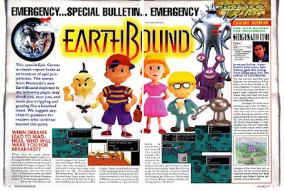
Examples of Double Page Spreads
Here are different examples of double page spreads in different magazine genres. While the overall idea is the same, magazines experiment with the presentation/visuals of the spread. This may be done in order to target their specific audience. For instance, WIRED is a more mature magazine in comparison to Nintendo Power. For this reason, WIRED's center spread is more structured and clean, while Nintendo Power has more images and colors in its center spread.
 |
| Entertainment (Billboard) |
 |
| Political (WIRED) |
 |
| Sports (ESPN Magazine) |
 |
| Gaming (Nintendo Power) |
 |
| Automobiles (Top Gear Magazine) |
Tuesday, October 8, 2019
Magazine Research: Double-page Spreads
Some of the conventions of double-page spreads are:
Layout: The overall presentation of the spread
Mode of Address: How the audience is spoken to.
Anchorage text: Text under the main picture, establishing a link with it.
Emotive language: Language that plays on the emotions of the reader.
Buzz word: Words such as "NEW" or "EXCITING" that pique the reader's attention.
Pull quotes: Quotes that is centered and enlarged in comparison to the other text.
REFERENCES:
- CONTENTS AND DOUBLE PAGE SPREAD. (2014, August 20). Retrieved October 8, 2019, from https://riddlesdownmedia.wordpress.com/year-11-gcse/contents-and-double-page-spread/.
Sunday, October 6, 2019
Magazine Research: Genres (Part 2)
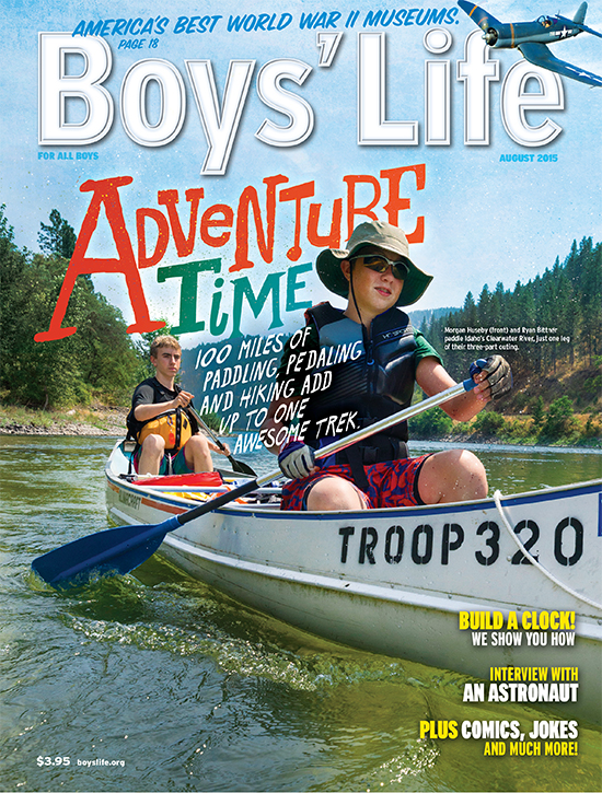
In my research, I have noticed that different genres, while maintaining some similar aspects, have different forms of displaying their specific content. Below, I have attached a magazine cover for the genres listed in my previous post:

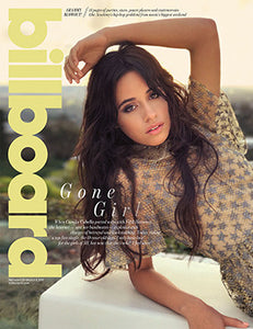





Sports

Entertainment

Lifestyle/Health

Children

Political

Environmental

Cars/Automobiles
Saturday, October 5, 2019
Magazine Research: Genres
Following conventions, I researched the different genres a magazine may showcase. A genre is the overall focus of a magazine's content.
Below are some of the magazine genres I found, along with corresponding examples:
Sports: Sports Illustrated, ESPN, Golf Digest, Powder
Entertainment: The TV Guide, Variety, Billboard, Cosmopolitan
Health/Lifestyle: Runner's World, Muscle & Fitness, Life Extension
Children: Boys' Life, Girls' Life, Babybug, Cricket
Political: The American Spectator, WIRED, Dissent
Environmental: Orion, The Ecologist, The ENDS Report
Cars/Automobiles: Hemmings Motor News, Top Gear (magazine), Automotive Industries
REFERENCES:
Writing for Magazines. (2015). Retrieved October 5, 2019, from http://www.scert.kerala.gov.in/images/2015/Plustwo/jounalism.pdf.
Friday, October 4, 2019
Magazine Research: Conventions
To start this project, I began researching the conventions of a magazine. Conventions are the different aspects of a magazine, specifically on the inside and the cover(s). For this post, I focused in on the conventions present on a cover.
Some of the conventions I learned through my research were:
- Masthead: The title of the magazine, tending to be "eye-catching"
- Tagline: Shows the focus of the magazine
- Coverlines: Shows what's inside the magazine
- Central image: Main image of the cover, used to draw the reader in
- Cover model: Person, often a celebrity, on the front cover of a magazine.
- Color scheme: The different uses of colors on the magazine cover.
- Header: A line or lines that gives readers more information about the magazine's content as a whole.
- Edition: The specific time (eg. month) a magazine was published.
- Tags: Words used to attract a reader's attentions, such as "NEW" or "EXCLUSIVE"
- Barcode: Often put in corners of magazines in a non-obstructive position.
In the following image, I identified some of the conventions of a Sports Illustrated cover from the summer of 2014:
REFERENCES:
- Liddell, J. (2016, April 29). Codes and Conventions of Magazines. Retrieved October 4, 2019, from https://www.slideshare.net/JordanLiddell/codes-and-conventions-of-magazines-61504976.
- Bostan, S. (2010, November 12). The Codes & Conventions of a Magazine. Retrieved October 4, 2019, from https://www.slideshare.net/SundasBostan/the-codes-conventions-of-a-magazine.
Subscribe to:
Posts (Atom)
Response to Compulsory Question 4
Question 4 Response Prezi
-
Cover Page Contents Page Double Page Spread Double Page Spread (LEFT) Double Page Spread (RIGHT)
-
Question 4 Response Prezi

