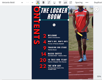
#7. Here, I added the image of Nasir Coffee that I selected for the contents page. I manipulated the image to best fit the dimensions of the page.
#8. I shifted the "CONTENTS" text box to the empty space, removing the obstruction of the image.
#9. I added a text box with the title of the magazine, "THE LOCKER ROOM". Not including it would have been a waste of space on the page. Further, I used the same font (Antonio Bold) for the masthead on the cover page. Additionally, it is in white so it can stand out from the other colors on the contents page.
#10. Using the technique detailed in Step 4, I added a red outline to "THE LOCKER ROOM" to make it appear more lively as opposed to plain white text.
#11. Here, I changed the page numbers to reflect the importance. For instance, the entire section based around Nasir Coffee is 5 pages long. I also rotated the "CONTENTS" text box to appear legible from left to right and positioned under the "THE LOCKER ROOM" text box. Finally, I added a sub-heading on the picture of Nasir Coffee, to emphasize even more that he is the focus of this magazine issue.


No comments:
Post a Comment