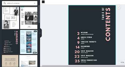
#1. Using the service Canva, I picked a "table of contents" template to start the design process.
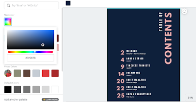
#2. The first change I made was the background color. I made a navy blue, differing from the black it came in by default.
#3. Next, I edited the placeholder entries to reflect the headers from the cover page. Instead of mentioning what type of piece it is, I used the sub-heading to describe what the article would be about.
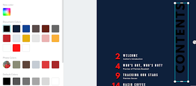
#4. I changed the color of the page numbers from pink to black. Then, I duplicated the page numbers, made the duplicates red, and overlaid it on the black numbers to create the effect of a shadow. This catches the reader's eye as the numbers "pop off" the page.
#5. The exact same procedures from the previous step are done here for the "CONTENTS" text.
#6. I rotated the "CONTENTS" text box by 180 degrees, so that the word can be read in a descending fashion as opposed to ascending.


No comments:
Post a Comment